I'm Ben! 👋




Role
Product designer, 2015 to 2018, after starting at GSoft as a marketing designer
Team
The Sharegate product and development team at GSoft
Platform
Desktop app for managing and migrating SharePoint and Office 365
Sharegate was a successful SharePoint tool that had grown screen by screen, and the company wanted to merge its two applications while users struggled to find the tools they needed. I moved from marketing design into product design, and we built a design system before redesigning a single feature. Then we merged both applications into one, with the same patterns on every screen. The result was Sharegate’s first design system and a modernized app for thousands of IT administrators worldwide.

Sharegate is a Microsoft SharePoint administration tool. IT administrators use it to manage and migrate their SharePoint and Office 365 environments, from moving content between tenants to checking who has access to what. Moving an organization’s SharePoint is not a job they can afford to get wrong, and they picked Sharegate because the native tools made those jobs hard.
The product was already successful when I joined GSoft, now Workleap. It had also grown screen by screen for years, and it showed. Buttons, layouts and workflows changed from one feature to the next, and the interface looked stuck in the past.
The company wanted to merge its two applications into one, sold under a single license. Users were having a harder time finding the tools they needed, which showed up as trials that didn’t turn into paid licenses. Developers were frustrated too: refactoring a screen meant fighting its own one-off components.
I joined as a marketing designer. Working close to the product, I saw that the development team had no consistent designs to build from, so each new feature brought its own patterns. That was where I could help most, and I moved into the product design role.
Redesigning features on top of inconsistent parts would only have added more inconsistency. So before touching the merge, we built a design system that fit the product and could grow with it.
The pieces came from the product’s real jobs. A keyword picker lets admins tag content and create a new keyword on the spot. A user search shows each account’s domain name and how many results came back. The scheduling dialog warns when a target was connected through the browser and may need a new sign-in later. Each component was drawn in all of its states, with an icon set to match.
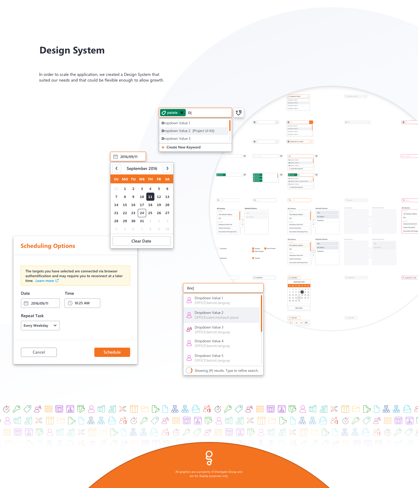
Pieces of the design system: keyword and user pickers, the date picker, the scheduling dialog and the icon set.
It gave engineers ready answers in place of one-off UI decisions, and it gave admins the same behavior wherever they were in the app.
With the system in place, we merged the two applications and redesigned the core workflows. SharePoint migration involves many content types, permission models and options, and IT admins need all of them. Hiding options was off the table, so the work was to make all that power predictable.
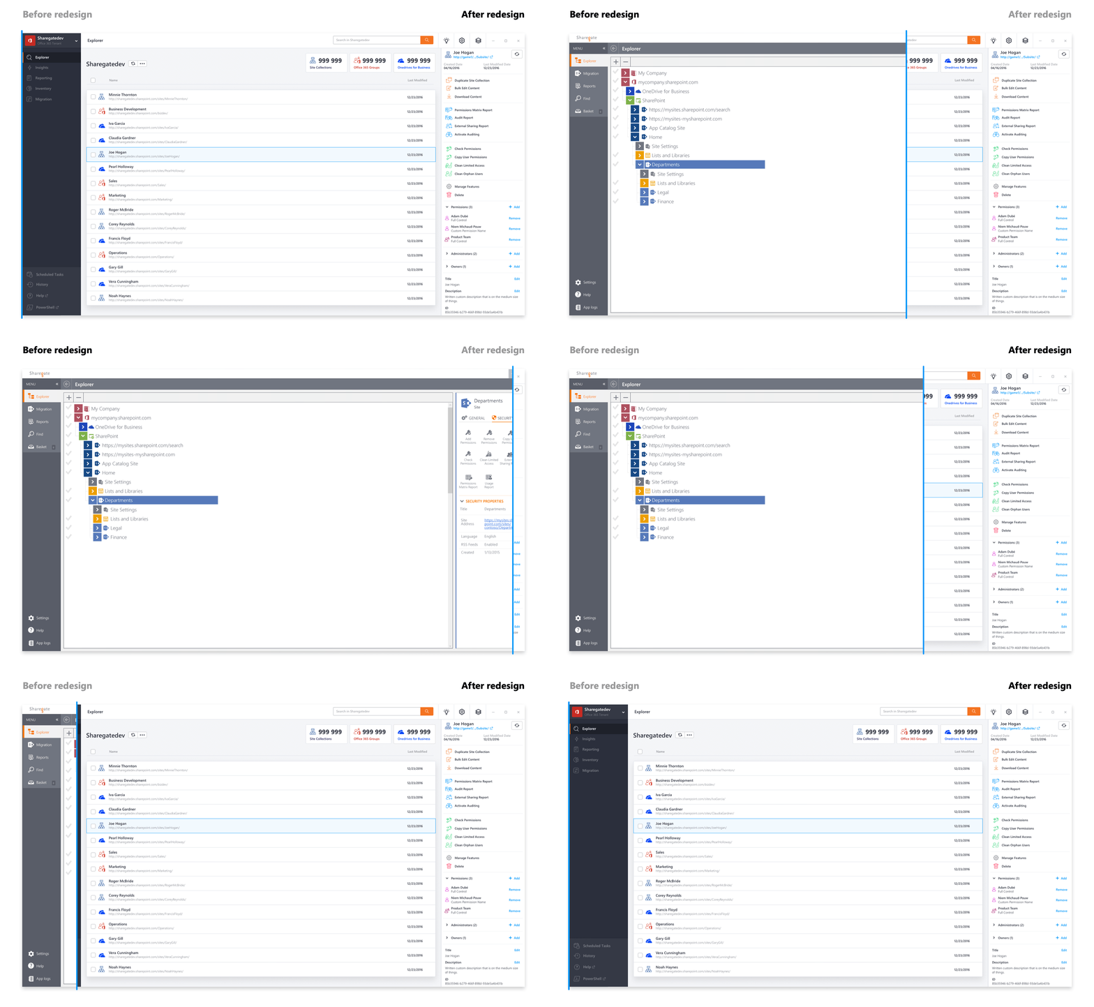
The Explorer is where admins start. Before, it was a tree of colored nodes with a grid of icon actions beside it. In the redesign, it lists site collections, Office 365 groups and OneDrives, with a count for each at the top. Selecting one opens a panel that groups every action by job: copy and download content, run permission and audit reports, clean up permissions, then review the item’s permissions, administrators and owners.
The navigation now follows the work: Explorer, Insights, Reporting, Inventory and Migration, with scheduled tasks, history, help and PowerShell at the bottom.
The same components carried through the rest of the app: connecting a first environment, the pre-migration inventory that flags warnings and errors before anything moves, the report builder with its rules and column picker, and the list of all tasks.

The merge and redesign: environment connection, pre-migration inventory, the report builder and all tasks.
The design system was the first at Sharegate, and the engineering team used it across the product. Features designed after it came out consistent by default. For the thousands of IT administrators who rely on the app, the result was a modernized interface that works the same way from one screen to the next.
Consistency is the improvement users feel on every screen.
Making every screen behave the same way did more to lower the effort of a complex job than any single feature redesign.

I started in marketing design and moved into product once I saw the development team had no consistent designs to build from.

I pushed to build the design system before redesigning any screen, so the merge wouldn’t add another layer of one-off parts.
The first design system at Sharegate, used across the product

Documented components and standard behaviors for confirmations, errors and progress gave developers something to reuse in place of one-off UI decisions.

Design systems are infrastructure
Every feature designed after the system inherited its consistency, which made it the most useful thing I built there.

Change how the team builds UI
On a team that was new to working with a designer, shifting how people thought about building interfaces mattered as much as any screen I drew.
Credits: Designed at GSoft, now Workleap, with the Sharegate product and development team. All graphics are property of Sharegate Group, shown for display purposes only.