
I'm Ben! 👋




Role
Senior Product Designer, Element AI, 2018 to 2019
Team
Element AI product and ML engineering, with a logistics partner
Platform
Desktop web app
Summary
Our logistics partner’s shipments ran on paperwork that people read and typed in by hand, and no extraction model would ever read every carrier’s template perfectly. That made the real question a design one: checking the AI’s work had to be faster than typing it. At Element AI, I designed the review screen around the model’s confidence, with the extracted fields next to the original scan and the field in focus highlighted on the page. The result was a review flow where a clean bill of lading takes seconds to confirm and attention goes to the fields the model is unsure of.

Every truck shipment comes with paperwork: bills of lading, proof of delivery, customs forms, freight invoices and packing lists. Much of it arrives as scans, faxes or photos of paper forms. Behind most logistics dashboards, someone is reading those pages and typing them into software, which is slow and easy to get wrong.
Our logistics partner wanted a model that could read those documents and fill in the shipper, consignee, commodity, weight and tracking numbers on its own.
The catch was the documents themselves. Every carrier, freight forwarder and customs broker has its own templates, and even a standard bill of lading looks different from one company to the next. No model would read all of them perfectly, so a person would always review what it extracted.
That set the design question for the whole product. If checking the AI took as long as typing the document in, the product had no reason to exist. So I designed the review around speed, and the main tool for speed was the model’s own confidence.
On an insurance underwriting product at Element AI, a single wrong call was costly and the review needed depth. Here each error mattered less, but the volume was much higher. Treating every field as equally suspect would have made people read the whole page again, and the AI would have saved nothing.
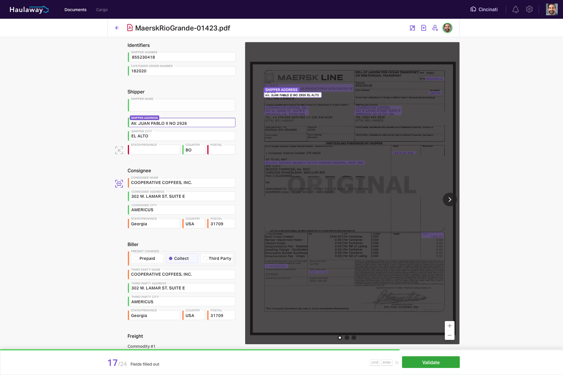
Fields the model was sure of are pre-filled and look settled, so reviewers can move past them unless something looks wrong. Fields it was less sure of show its best guess, clearly marked for a check. Fields it couldn’t read stay empty, with the matching spot on the document highlighted so the reviewer knows where to look.
A colored bar beside each field carries that state. A clean bill of lading from a common carrier takes seconds to confirm. A messy or handwritten form takes longer, but still less time than doing it by hand.

The extracted fields sit on the left, grouped the way the document is: identifiers, shipper, consignee, biller and freight. The original page sits on the right. When a reviewer focuses a field, its label and value are highlighted on the scan, so they never have to hunt for where a value came from.
A counter at the bottom shows how many fields are filled out, and a single Validate button, also reachable from the keyboard, closes the document. The goal was a rhythm reviewers could keep up across a long queue.
Documents were one of two tabs in the product. The other, Cargo, holds a freight planner: trailers grouped by destination, each with its shipments laid out as cards, under a countdown to the next cutoff. From there a planner can view a trailer’s manifest, lock shipments in place and confirm the freight.
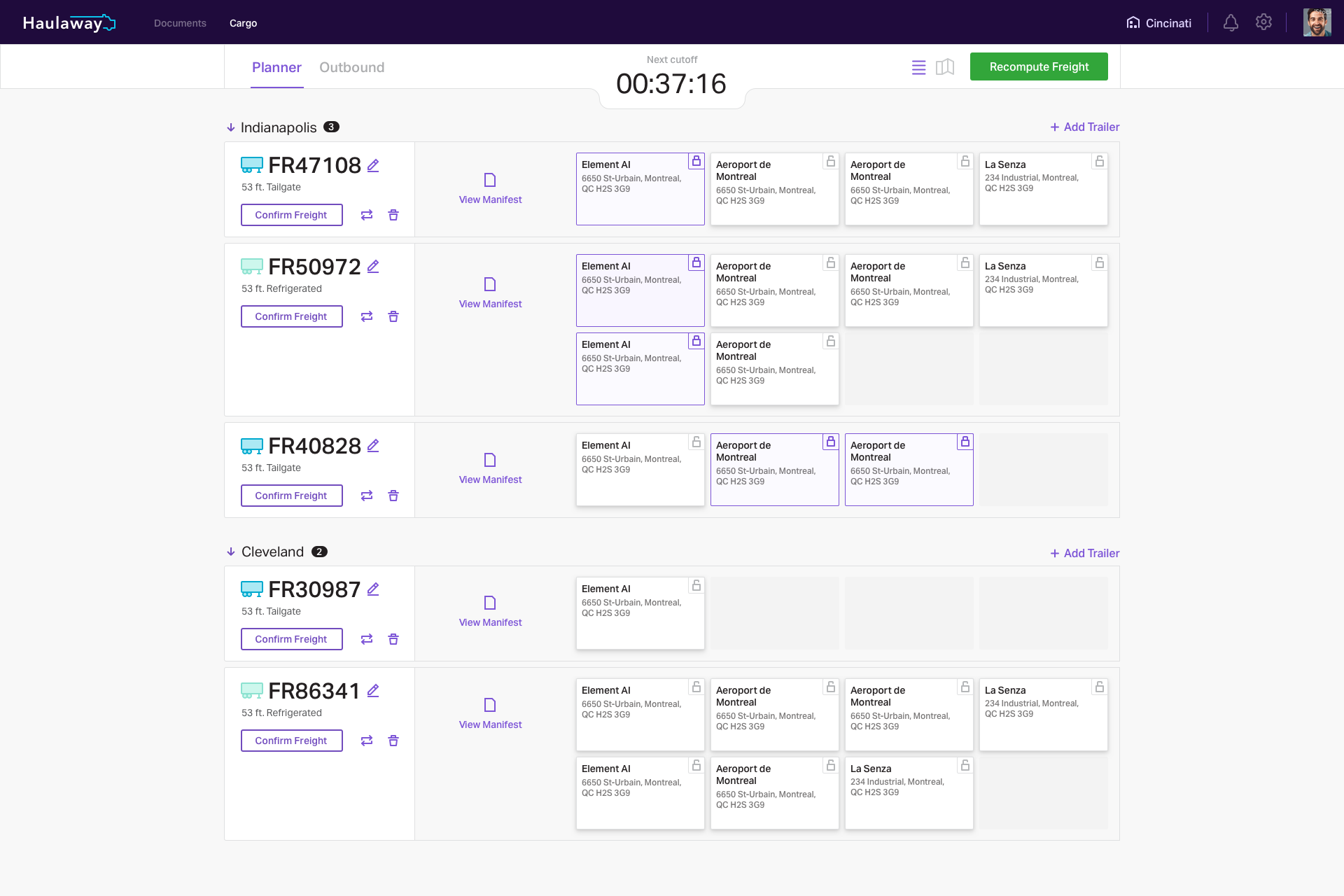
The Cargo planner. Trailers are grouped by destination, with a countdown to the next cutoff.
The idea behind the work
Spend the reviewer’s attention where the model is unsure.
When most fields are right, the interface should let people move through them and stop only where the AI needs help.

I framed the product around one test: reviewing the AI’s output had to be faster than typing the document in. Every screen decision was judged against it.

I worked with ML engineering to map the model’s confidence to three field states, each with its own treatment on screen.
Colored confidence bars on every field of the review screen

How sure the AI is came up in every Element AI product I worked on. I adapted the same graduated treatment to each one, tuned to the stakes and volume of the work.
Four AI enterprise products designed in one year

Design for the common case
When most fields are extracted correctly, let people move through them quickly and focus on the few that need attention.

Volume changes the design
Insurance underwriting needed depth on a few high-stakes decisions. Document review needed speed across hundreds of smaller ones. The same principle produced very different screens.
Credits: designed at Element AI with the product and ML engineering teams, for a logistics partner.
